Website Facelift Numero Deux
Seems as though my website has been acting up lately. This week, I noticed it was acting all virus-ey and posts were getting click jacked. Before that, the two right hand columns had merged together instead of being separate, like they used to be… and some posts weren’t even showing up any more. <grumble grumble>

KateWares as it appeared in 2013, after the first facelift.
I finally had a little time to do some research. Turns out my old WordPress theme “Snaps” hadn’t actually been modified for at least two years… and it was no longer compatible with current WordPress updates! (i.e. there were no “fixes” for my problems) Dang. The only thing left to do was to find a new and compatible theme…

PhotoBlogster theme for WordPress
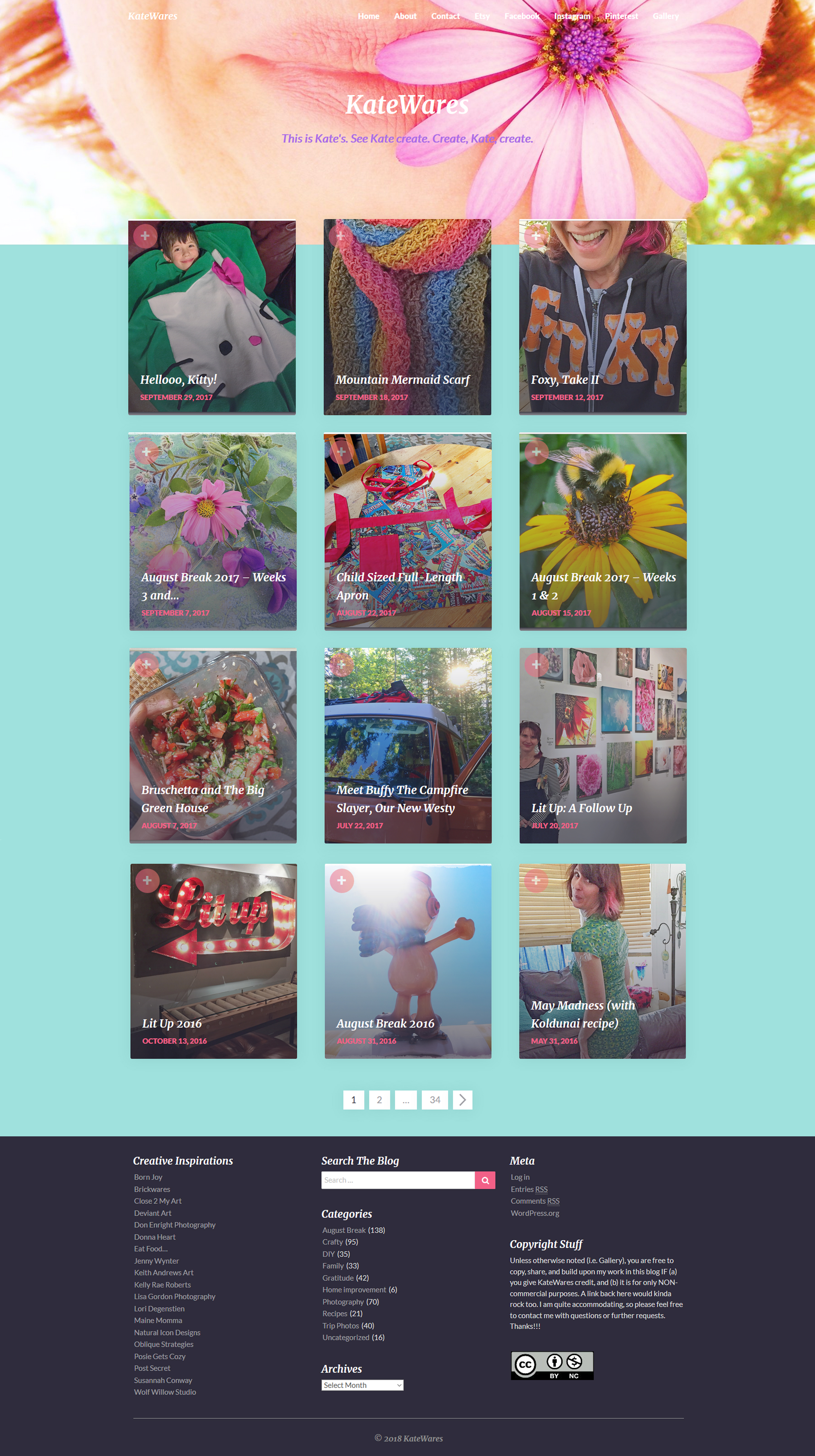
I finally settled on “PhotoBlogster”, as it was as similar to the old theme as I could find (with a little editing, of course). There are a few changes: only three columns instead of four on my computer screen (and one instead of two on my phone)… the “thumbnail” images are a different – and changeable – dimension, so they crop kinda funny… and all of my “tags” information that used to appear for each post is now gone (I’ll try to find that and bring it back somehow)… BUT. At least it’s something.

KateWares updated site, circa 2018.
Sorry for any inconvenience you may have experienced (or will experience, in the future) due to the changes. Let me know how the new digs are working for you – and what I need to address (i.e. with *this* entry, I just found out that I can have larger than 620px wide images in individual posts… so that’ll be fun to experiment with!) Anyhow. I’ll try to add some new content soon – I’ve got some great new poncho-wraps I can’t wait to show off! Toodles.
=) Kate

2 Replies to “Website Facelift Numero Deux”
Sure looks good to me, Kate, and absolutely no issues at all.
Happy day to you, my friend.
xo.
Thanks, Lisa! =) K